We make brands more successful
High-level rebranding doesn’t have to take long
Guided by strategy, we deliver perfectly aligned brand names and comprehensive visual identities within 3 months. Rebrandt® creates cohesive visual systems, combining logos, colors, layouts, typography, and photography into a unified visual presence. A distinctive identity, name, and logo that clearly reflect the brand's essence make marketing activities easier, more efficient, and highly effective.
Want to know more? Book a free video call. Our experts are happy to assist with your current questions and can clearly outline what to focus on when preparing for a rebranding.
Rebrandt® has regularly received international Awards such as the Red Dot Award, Gold at A'Design Award and the Global Rebrand100Award several times. Read more about our Awards on our awards page.
Below are some key elements highlighted from our development process to create the optimal brand name, logo, and identity. You can learn more about our approach on our 'how we work' page.Want to know more? Book a free video call. Our experts are happy to assist with your current questions and can clearly outline what to focus on when preparing for a rebranding.
Rebrandt® has regularly received international Awards such as the Red Dot Award, Gold at A'Design Award and the Global Rebrand100Award several times. Read more about our Awards on our awards page.
The logo
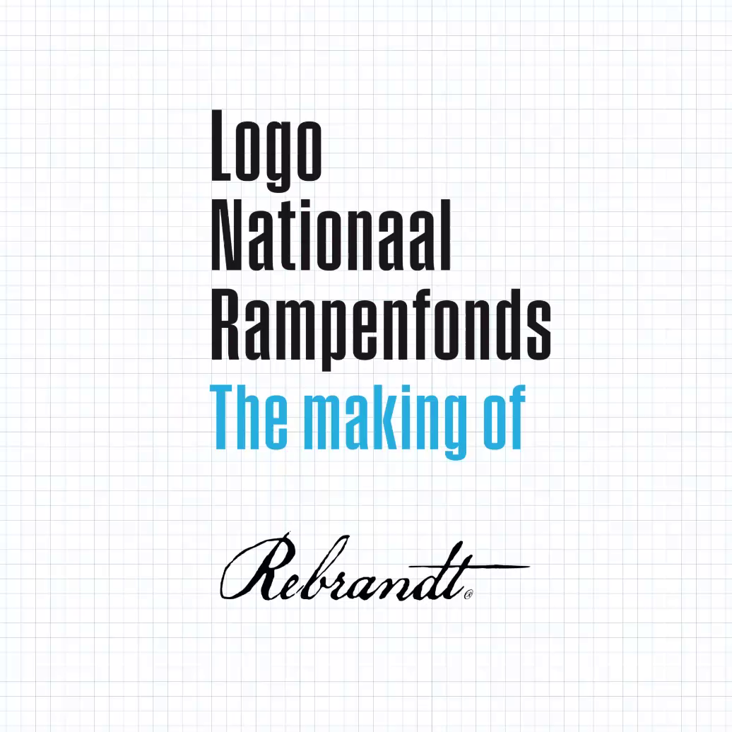
The figurehead of a brand can encapsulate much of its story with remarkable simplicity. Designing a logo is a specialized skill, requiring a rare ability to create meaningful yet simple designs. At Rebrandt®, our designers sketch extensively, refining and exploring shapes until they find one that perfectly aligns with the brand. Once the right concept is sketched, the meticulous process of refinement begins—every detail must be flawless.As a glimpse behind the scenes, Rebrandt® has compiled the logo sketches created for the National Disaster Fund:
Colours
A rebranding is in most cases a significant transformation, but sometimes simply adjusting minor details, such as the color palette, is enough.
Sometimes, a rebranding focuses solely on updating the color palette, underscoring the critical role this element plays in shaping a visual identity. The Rebrandt® team features expert stylists who excel at curating and harmonizing colors to align with a brand’s essence. The chosen colors, once finalized, convey a significant portion of the brand's narrative.
A compelling example is the rebranding of Omring. Initially, this home care organization provided household assistance but transitioned to offering specialized medical care. The updated color palette introduced a more clinical and professional aesthetic, which continues to reinforce the brand's positioning. These pivotal colors emerged during the style research phase, reflecting a meticulous and strategic approach to rebranding.

A compelling example is the rebranding of Omring. Initially, this home care organization provided household assistance but transitioned to offering specialized medical care. The updated color palette introduced a more clinical and professional aesthetic, which continues to reinforce the brand's positioning. These pivotal colors emerged during the style research phase, reflecting a meticulous and strategic approach to rebranding.

Layout en typography
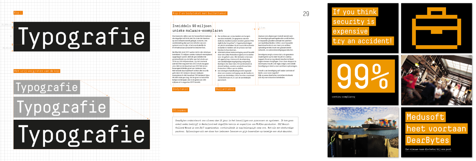
One of the key pillars of your brand’s visual communication is the typography and the layout in which it is used. The creative team works to find the ideal combination of typefaces, determining sizes, spacing, and how they interact within a layout. All these choices are documented in the guidelines. After completing the rebranding, Rebrandt® provides the client with the open files, including typograms and layouts, ensuring they can be applied and replicated seamlessly.

Photography
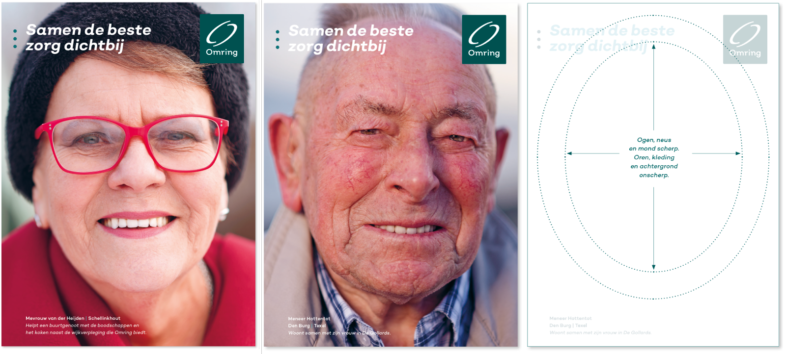
If the desired photographic visual language is carefully considered in advance, a conceptual guideline can be drawn up that various photographers can then work with. The way of portraying. What do we show and what not? What atmosphere do we want to reflect in photography? Do we create an image bank or are guidelines sufficient to guide the various photographers? These are all questions in which Rebrandt® will guide the client. Below you will find a good example of clear guidelines for photography, accompanied by technical photographic settings. This allowed several photographers to work for Omring and kept photography consistent.
Rebrandt® also provides the necessary frameworks and examples when setting up a more illustrative style.
If the desired photographic visual language is carefully considered in advance, a conceptual guideline can be drawn up that various photographers can then work with. The way of portraying. What do we show and what not? What atmosphere do we want to reflect in photography? Do we create an image bank or are guidelines sufficient to guide the various photographers? These are all questions in which Rebrandt® will guide the client. Below you will find a good example of clear guidelines for photography, accompanied by technical photographic settings. This allowed several photographers to work for Omring and kept photography consistent.

Rebrandt® also provides the necessary frameworks and examples when setting up a more illustrative style.
All corporate guidelines
in a brand protocol
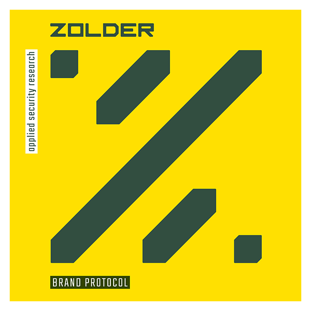
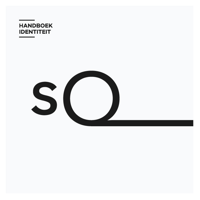
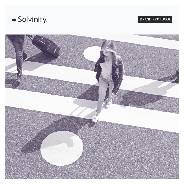
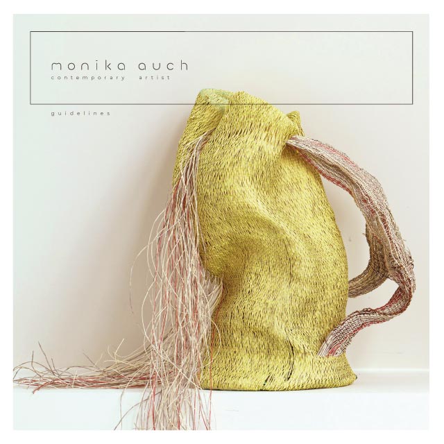
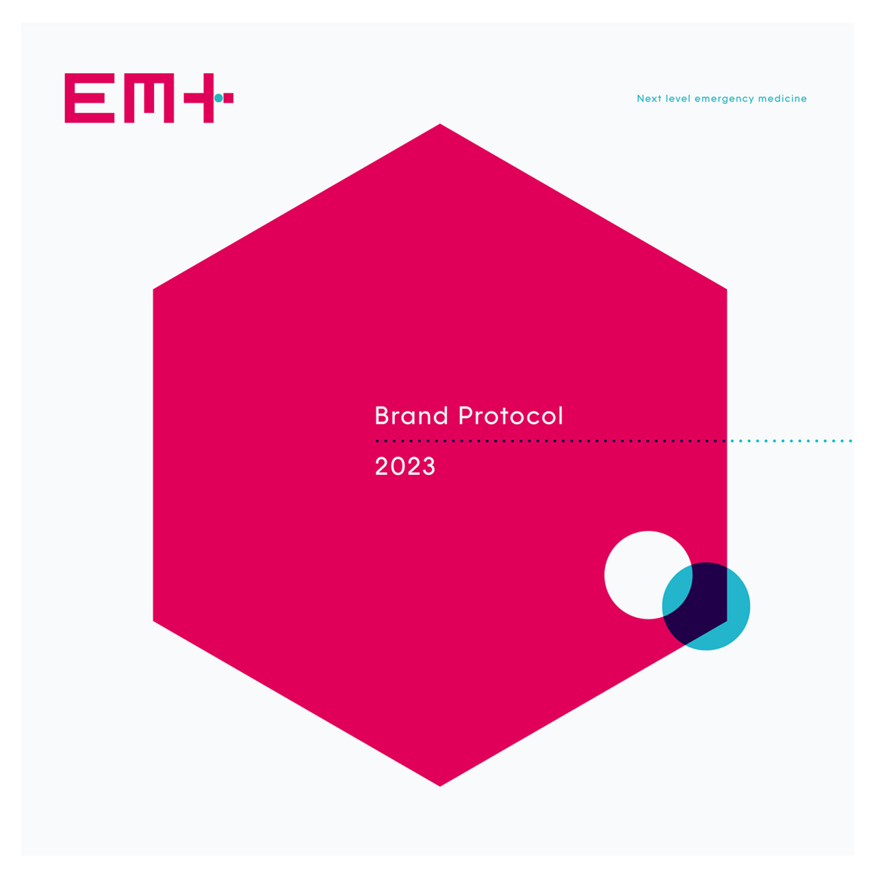
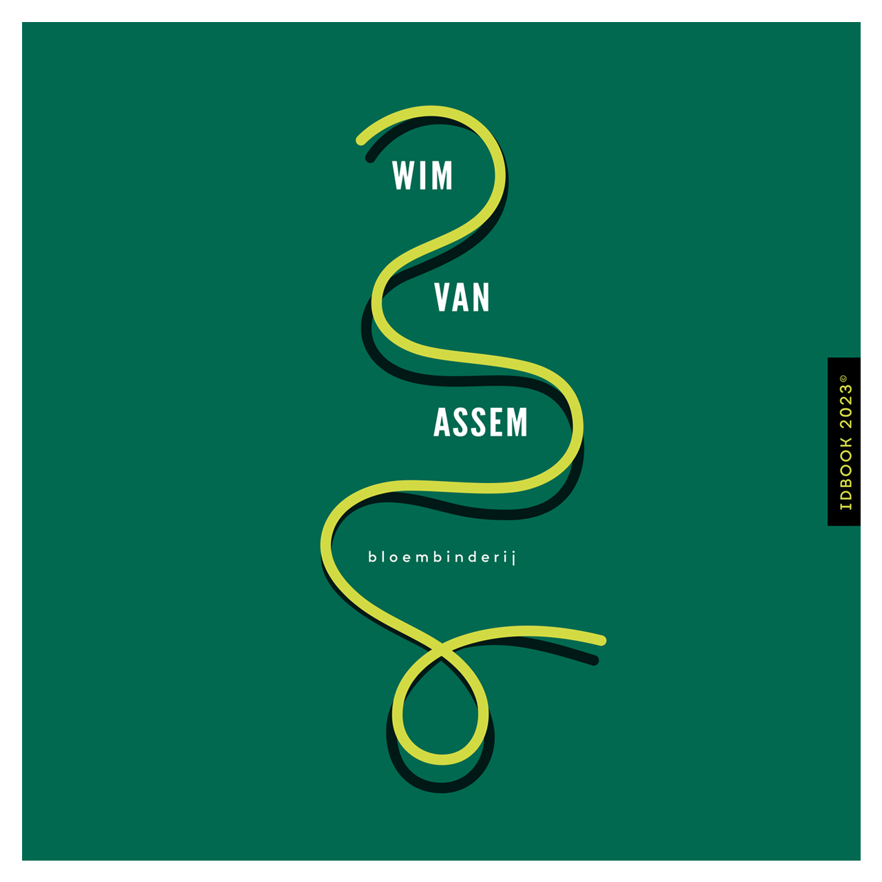
A visual identity has been developed with great care and commitment in an intensive collaboration between client and agency. The new form system is tailor-made so that all core values are supported. Developing a visual identity is '1', turning an identity into a strong brand is '2'. To grow into a strong brand, it is crucial for recognisability and reliability to be consistent in all communications. To achieve this, the correct colours, fonts, dimensions and rules have been summarized in the brand protocol.
See below a number of fire protocols for inspection. For more information about the possibilities of developing a brand protocol, please contact Rebrandt® info@rebrandt.com / t 020 8200983 or request a quote directly online.
Receive our quotations directly
