
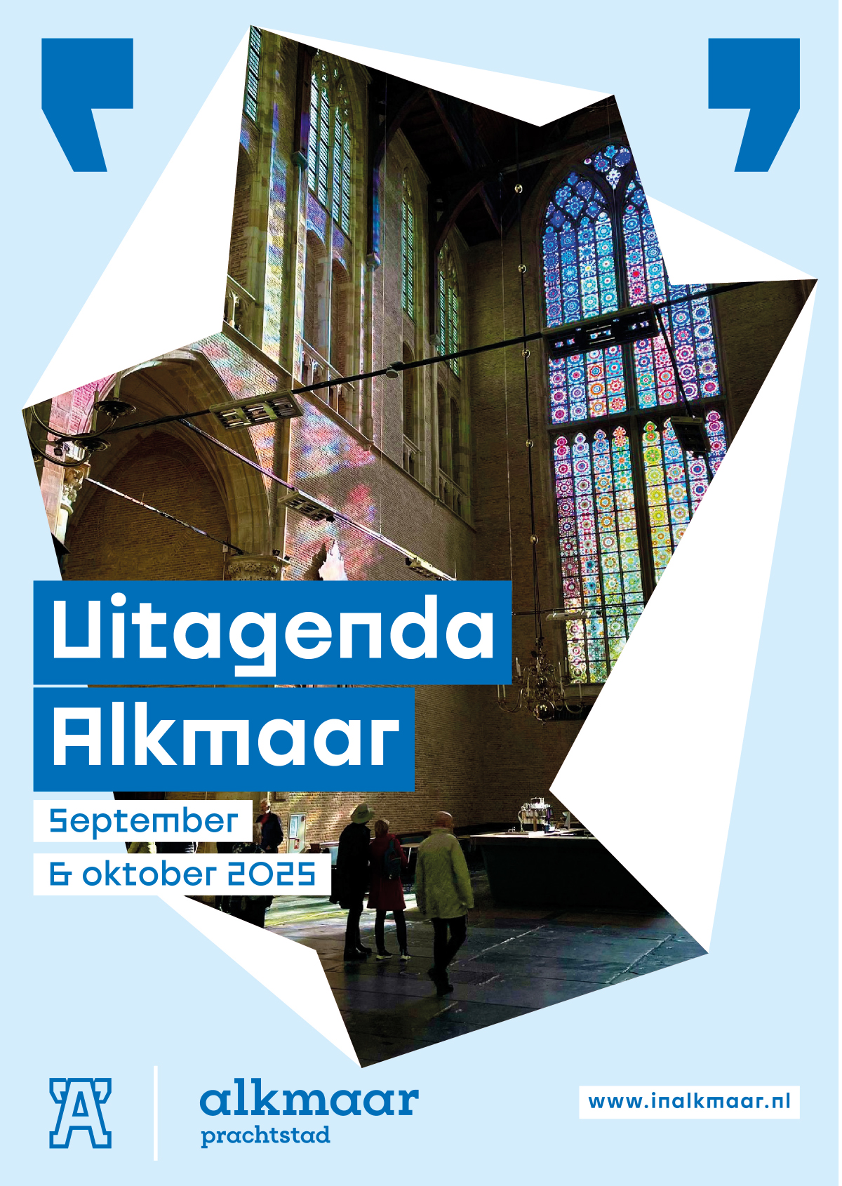
New logo and identity for the city branding of Alkmaar
Rebrandt has developed a completely new marketing identity for the city of Alkmaar. The aim of the new identity is to position the city more powerfully towards new residents, companies and visitors. Bureau Buhrs developed the story of Alkmaar, on the basis of which Rebrandt got to work.
The A-status
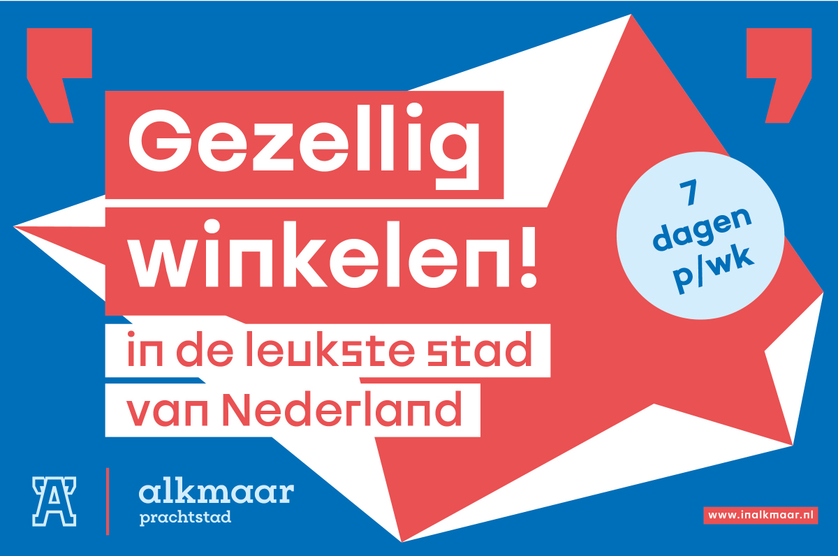
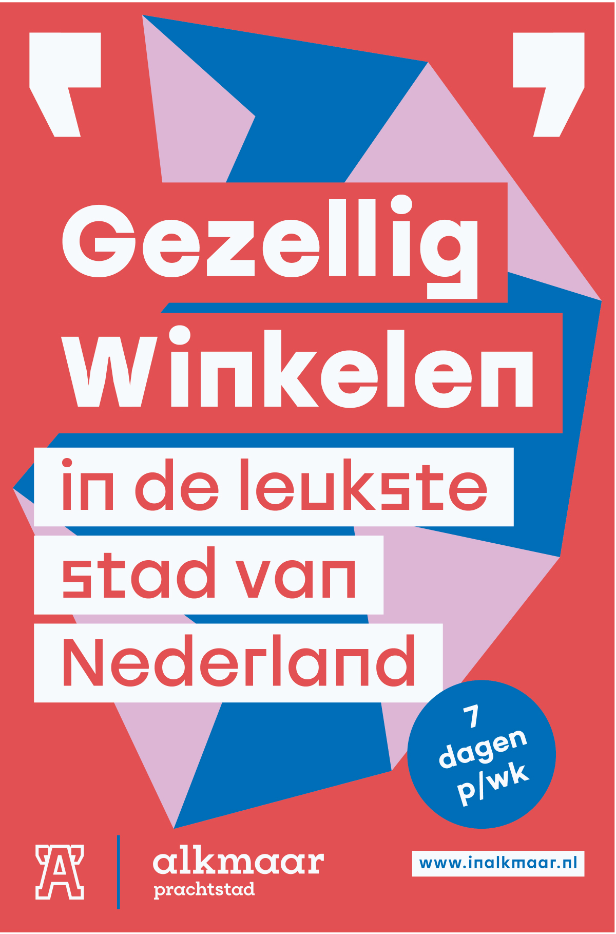
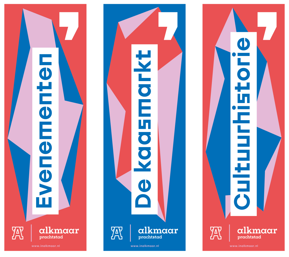
Alkmaar has grown considerably in recent years in terms of business, residents and tourism, but wants more. To support this ambition, Rebrandt developed an identity with which Alkmaar can show what it is worth. The quotation marks mark the 'A' as an honorary title. Modesty has made way for a self-assured A-status. At the same time, the logo draws the silhouette of the Torenburgh tower: the connecting symbol of Alkmaar residents since obtaining city rights. This beautifully intertwines the historical value and the future of the city.
"Placing the 'A' on a pedestal exudes ambition and at the same time has an important stimulating effect," says Rebrandt's brand architect Ruud Winder. "Saying out loud that you are going for A-status also obliges you to realize this ambition. City branding is therefore an important building block in the growth of the city." In addition to the logo, Rebrandt developed the Alkmaar Magazine, the numerous billboards in the city, the AlkmaarPas, the complete design system and the guidelines with which Alkmaar can put itself firmly on the map.

The A-status
Alkmaar has grown considerably in recent years in terms of business, residents and tourism, but wants more. To support this ambition, Rebrandt developed an identity with which Alkmaar can show what it is worth. The quotation marks mark the 'A' as an honorary title. Modesty has made way for a self-assured A-status. At the same time, the logo draws the silhouette of the Torenburgh tower: the connecting symbol of Alkmaar residents since obtaining city rights. This beautifully intertwines the historical value and the future of the city.
"Placing the 'A' on a pedestal exudes ambition and at the same time has an important stimulating effect," says Rebrandt's brand architect Ruud Winder. "Saying out loud that you are going for A-status also obliges you to realize this ambition. City branding is therefore an important building block in the growth of the city." In addition to the logo, Rebrandt developed the Alkmaar Magazine, the numerous billboards in the city, the AlkmaarPas, the complete design system and the guidelines with which Alkmaar can put itself firmly on the map.

Brand protocol
Digital copy


Meet the masters...